Fired Up
EXHIBITION BRANDING
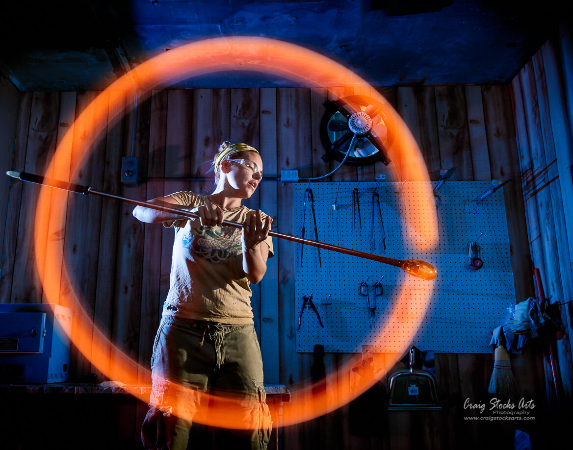
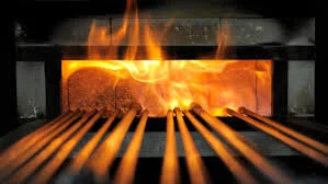
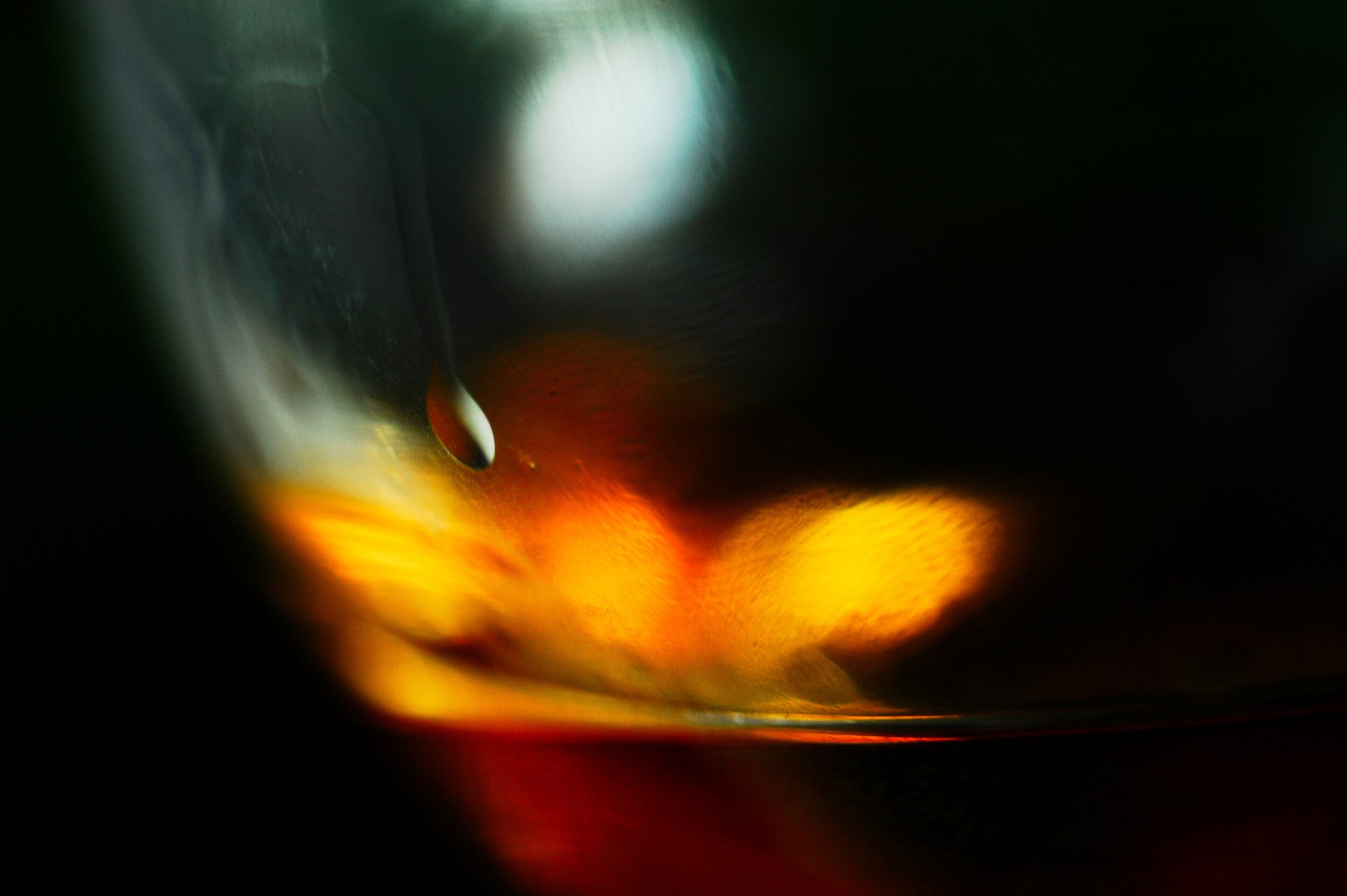
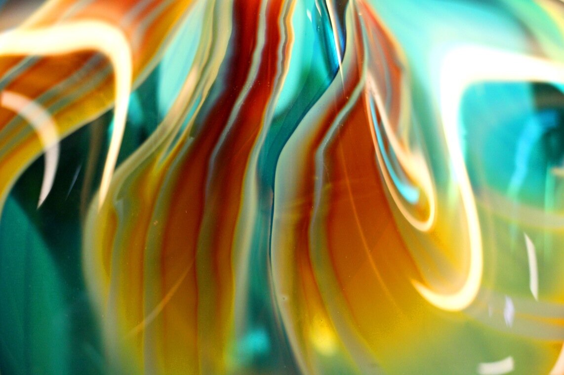
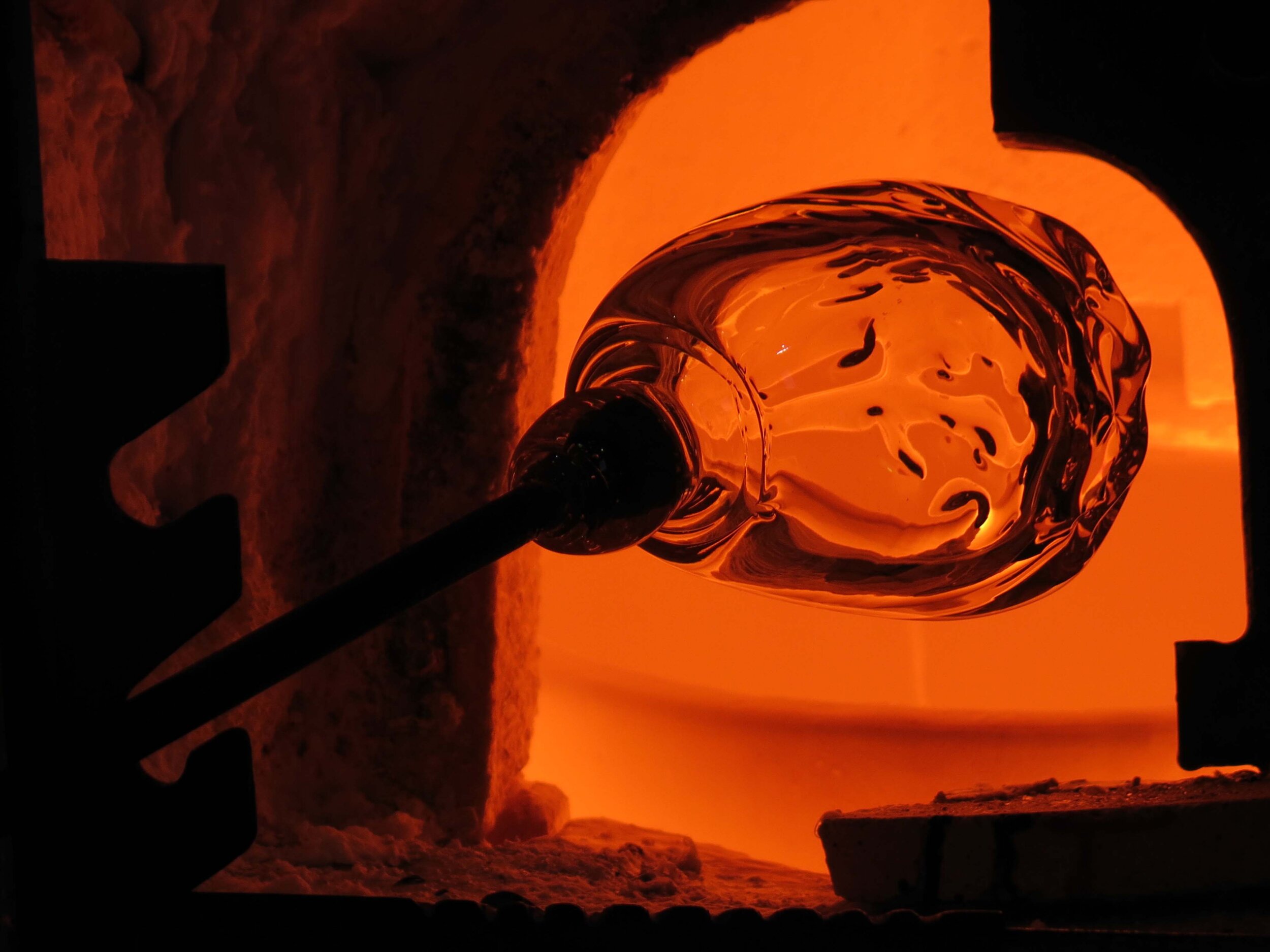
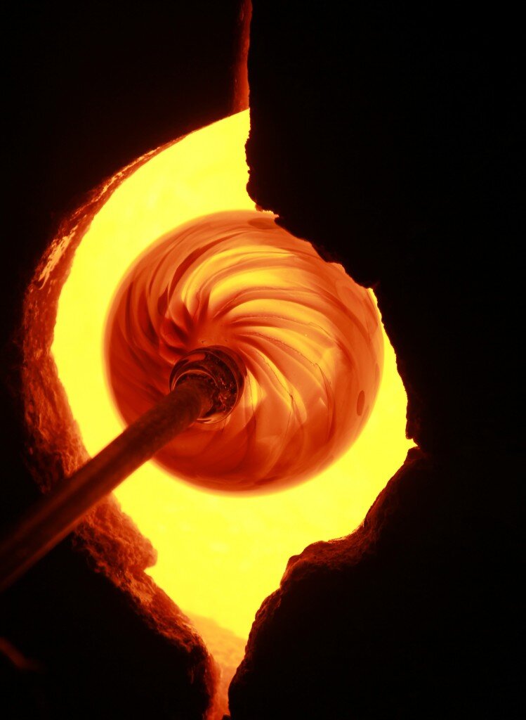
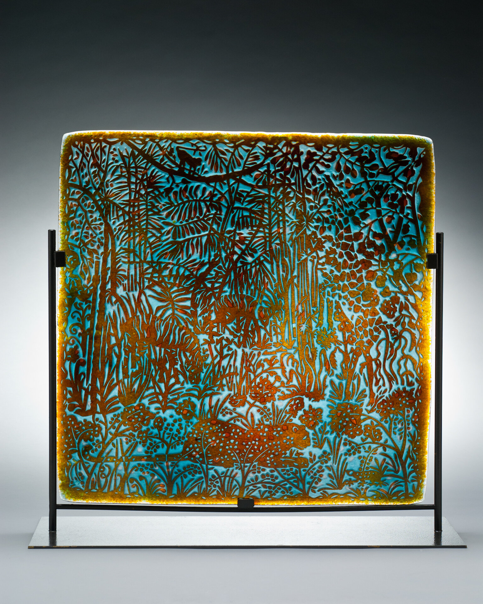
The Mint Museum is showing a special exhibition featuring works in glass by women. I started my branding exercise off with some research into the art form. Heat, fire, flames were all elements that came up in my research as well as the style guide sent from the Mint.
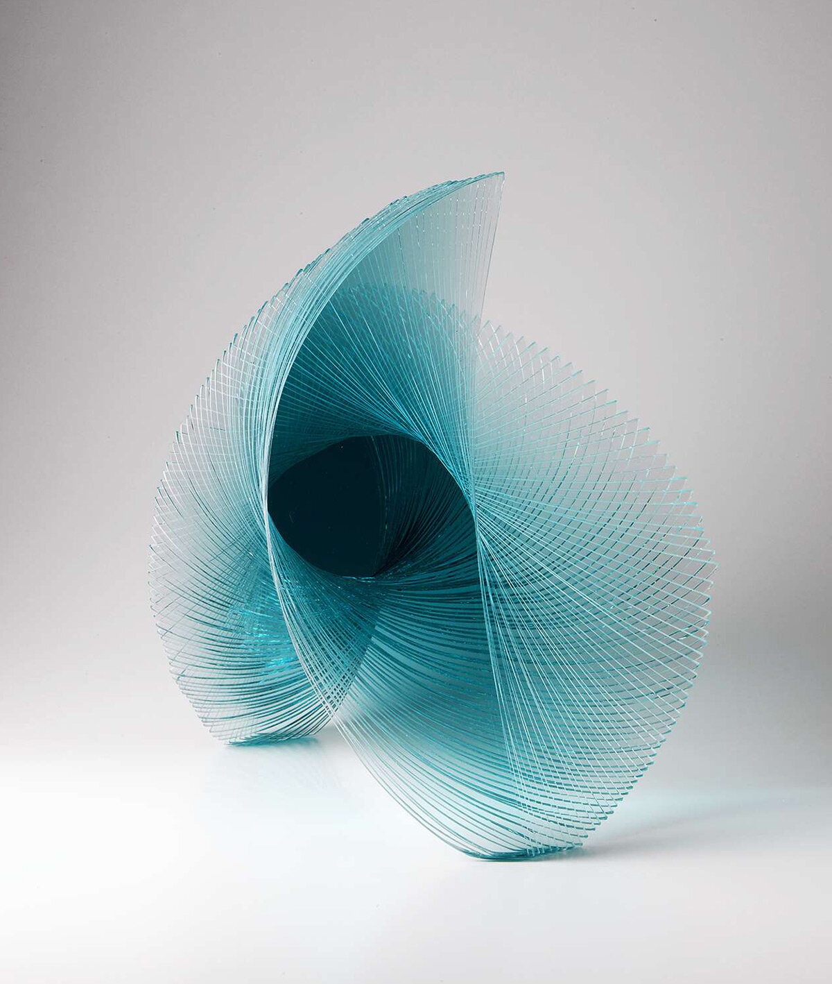
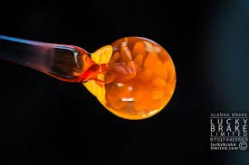
I noticed in my research the method of swirling trails of different colored glass and how the pieces overlaid and created new colors. I also loved the tight swirls and patters that would show up in the blowing process.
A flame is an obvious direction for a show titled “Fired Up” so I started sketching to determine ways to make a flame more unique to the show. As I sketched, I worked very loosely and began to notice shapes that looked similar to a head and so I started playing with that direction. I studied what it would look like to layer pieces of the identity in a way that would mimic the color changes that would happen if I was creating it out of glass.
The following shows my final design direction and how the identity I created could be implemented in the title wall and typography throughout the exhibition.